


The step-by-step guide
I created this guide to support you every step of the way 🌸
I'll share my tips, tricks, the materials I use, and my organizational methods ✨
Everything is for guidance only; there are no obligations, feel free to adapt it to what suits you best 💜
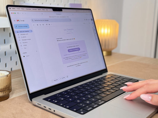
Downloading
After your purchase, you instantly receive an email from which you can download your PDF 💌
Remember to save it so you can easily find it again 🥰

Downloading
Just your phone or computer ✨
Download Email
After your purchase, you will receive an order confirmation email 💌

Inside, you will find a button to access your order and download your PDF(s) ✨

It may happen that this email arrives in your spam or promotions folder, so remember to check ☺️
If you haven't received anything within 5 minutes, you can contact me here.
To not lose anything
If you have lost your file, you can re-download it via the link received by email, but please note that downloads are limited to a maximum of 3 times.
A little tip, download your PDF from a computer rather than a phone, I find it easier to find your downloads there 🥰
Once downloaded, you can, for example, save it in a dedicated "Swatch charts" folder to be sure to find it later ✨
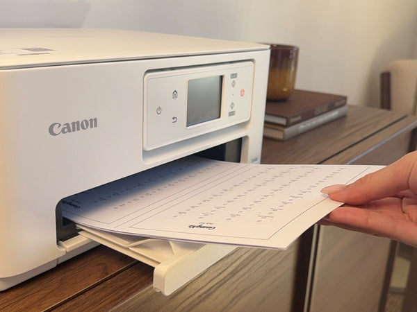
Printing
For the swatch charts, printing is done on A4 pages (2 swatch charts per page).
For the sheets, you have the choice between A4 (2 sheets per page) or A5 (1 sheet per page).
To maintain the correct dimensions, print at actual size (100%). Ideally, use thick paper to prevent your sheets from curling ✨

Printing
The page format
For swatch charts, printing is done on A4 size pages (2 swatch charts per page) 🥰

For sheets, you have the choice between A4 (2 sheets per page) or A5 (1 sheet per page) ✨


The type of paper
I always use thick and sturdy paper: thick to prevent it from warping with markers, and sturdy so that masking tape can be removed without tearing the paper ✨
A small point of attention, not all printers handle thick paper. For example, my printer has a special rear tray for thick paper, and a bottom tray for standard paper 🙏

Classic / dark dotted lines
The acrylic marker swatch charts have light dotted boxes. Depending on your printer, settings, and paper, these dotted lines may appear more or less visible. This is why I have provided 2 versions:
- Classic dotted line version
- Darker dotted line version
You can start with the classic dotted line version, and if after printing your dotted lines are not visible enough, do not hesitate to use the darker dotted line version 🥰
Be careful that your dotted lines remain light enough so that they are no longer visible once the box is colored ✨
Print settings
Here are the settings I use ✨
- Pages to print: according to the selected version
Select the pages corresponding to the version you have chosen, for example: range from 2 to 6.
- Paper size: A4 or A5
Depending on the format you are printing on.
- Scale: actual size (100%)
By default, many printers add small margins, which reduces the size of prints and can make the written document too small/illegible. To check that everything is correct, measure the border after printing, it should be 12.5 x 20 cm 🥰
Some printers do not print all the way to the edge. If your frame is cut at 100%, change to 99%, then 98% if needed, until everything is visible.
- Quality: optimal
For a clear result. Depending on your printer, this setting may also be called "High quality", "Elevated"...
- Feed from: rear tray
So that your printer properly takes your thick paper and not the regular paper that is in the bottom tray. Remember to tighten the side guides of the tray to center your sheets 🥰

If you don't have a printer
If you don't have a printer, I recommend going to Bureau Vallée with your USB key; they have all the necessary equipment and are there to help you if needed 🥰
Before I got my own printer, I always went there to print.
You can bring your own paper or choose one on site (I recommend their 160 or 250 g paper). Cutting is also available in store ✨
Expect to pay between 10 and 30 cents per page on average, depending on the number of prints and whether you provide the paper ☺️
For those who want to use masking tape, I'm not sure if their paper is resistant enough. If you don't want to take any risks, remember to bring your own.

Cutting
From your A4 page, you can cut in 2 ways depending on your preference:
- following the centre line, to get an A5 format
- following the frames, for a 5 x 8 inch index card format
In the organisation section, I share storage ideas based on the format you have chosen 🥰

Cutting
Two ways to cut
You can cut your page as you wish, here are the 2 most common ways ✨ :
- By following the center line, to get an A5 format
- By following the frames, for a 12.5 x 20 cm index card format

Anticipate storage
The cut largely depends on the storage you want to use afterwards, remember to check the size of your binder or pockets before cutting ☺️
For my part, I cut my swatch charts to index card format (12.5 × 20 cm) so that they are small and easy to handle, and my sheets to A5 format to have room to punch holes without encroaching on the frame 🥰

For more details and storage ideas, head to organization section 🌸

Punching
The pellets are there to help you perforate well in the center of the boxes. The holes then allow you to find the right color by superimposing your swatch chart on the legend or the solution 🎨
As acrylic markers are opaque, I perforate before coloring. For other mediums, as the rendering is transparent, I perforate after ☺️

Punching
Why punch your swatches?
The holes allow you to find the right color by superimposing your swatch on the legend or solution 🎨

For clean holes
- Use a cutting mat
It's important both to protect your desk/table and to get clean holes ✨
Before, I used cardboard, but it wasn't rigid enough, it sagged, and as a result, my holes weren't neat. I also heard negative feedback about glass surfaces: too rigid, and the paper slips a lot 🙏
Your mat will become more and more marked over time, which is completely normal, it just shows that you are using your punch correctly 🥰

- Punch right in the center
The dots are there to serve as a guide and help you punch in the center of the squares ✨
Once properly positioned on the dot, I press my punch all the way down until I feel the stop. For the diameter, I use 4 mm (which corresponds to the largest available on my punch).

- Don't let your paper spin
When you punch, your paper can naturally spin if you don't hold it, and shift the hole.
To hold my paper, I punch with one hand and hold it with the other 💪

The trick to being able to punch with both hands is to use 2 small pieces of masking tape on 2 corners of your paper to hold it 🪄

- Regularly empty your punch with a toothpick
I empty my punch with a toothpick at the end of each sheet to avoid jams 🥰

Before or after coloring?
For transparent markers and pencils (alcohol, water, colored pencils), I punch after coloring. Their rendering is transparent enough to let the dot show through, and punching beforehand can slightly hinder coloring afterward 🙏
For opaque markers (acrylics), I punch before. If I start with coloring, I won't see the punch dots anymore and it will be difficult to punch in the center by eye ☺️
Selection extracted from my social networks ✨
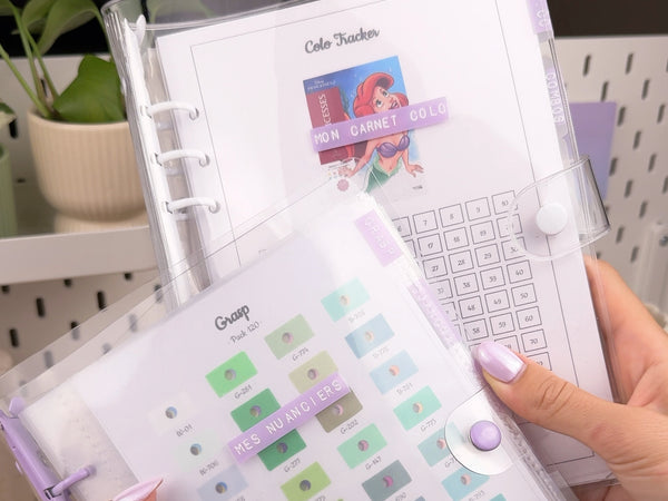
Organization
I organize myself with a binder for my swatch charts, another for my sheets, and a stand on my desk for the swatch charts I use most often 🌸
I'm also sharing other ideas to inspire you in the complete guide ✨

Organization
What I use:
Other ideas:
Let's talk organization ✨
I'm going to share my own organization as well as other ideas, so you'll have plenty of inspiration to decide on your organization 💜
At the very beginning, I simply slipped my swatch charts into corner pockets that I cut to the correct dimensions, which was super practical. Then I started to have different brands of markers and sheets, and wanted something more structured. Today I have a binder for my swatch charts, another for my sheets, and a stand on my desk for the swatch charts I use most often 🌸
Swatch chart binder
For my swatch charts, I use a binder with dividers and pockets 🥰

The pockets allow me to easily take out and put away my swatch charts without having to open the rings ✨
I chose pockets that are a little larger than my swatch charts for 2 reasons:
- To easily grasp my swatch charts inside, without damaging them. When the pocket is exactly the right size, I find it a bit harder to take them out without damage ✨
- To be able to group all the pages of the same swatch chart in the same pocket. For example, for my GuangNa 360 swatch chart, since the pocket has extra space, I can put all 8 pages together. When I need the swatch chart, I take everything out at once, which is super practical 🥰
The dividers allow me to organize the swatch charts by brand and find them easily.

A quick note on pockets: the formats are not always easy to understand. An "A5" pocket does not mean an A5 sheet fits inside, but that it is designed for an A5 binder (so the inner sheet is smaller than an A5). Be sure to check the exact dimensions before ordering ☺️
Sheet binder
For my sheets, I use a binder with dividers 🥰

Unlike my swatch charts, I don't need to take my sheets out of the binder, so I don't use pockets. Instead, I punch my sheets with the 6-hole punch so I can slip them into the rings ✨
The dividers allow me to separate:
- TRK & CC: trackers and color codes
A little trick, I cut the corners of my color code sheets so that my tracker sheets serve as bookmarks.


- Combos
For my skin and hair combo sheets.

- Pattern
For my cozy pattern sheets.

- Thumbnails
I store my stock of thumbnails in a pocket, which allows me to have them available as soon as I finish a coloring to fill in my color code sheet ☺️. I like to print my thumbnails according to my next colorings, I rarely prepare all the thumbnails of a volume at once.

Desk swatch chart holder
On my desk, I have an Ikea pegboard with hooks on which I hang the swatch charts I use most often, so they are within reach 🥰
It also adds a colorful touch to my desk decor, I love it 🌈

Other ideas
Some other ideas to inspire you:
- Corner pockets cut to the correct dimensions

- An A5 display book

- A brochure holder

- Rings

Selection extracted from my social media ✨
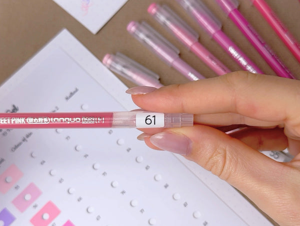
Labeling
Some packs are not numbered, so I use labels that I stick on each pen/pencil.
I then cover them with tape so that they last over time ☺️

Labeling
Some packs are not numbered, so to make a swatch chart, you need to add numbering to them 🤗
Sticking labels
The swatch chart itself is already numbered from 1 to the total number of markers 🥰

You just need to stick the corresponding labels on each marker.

For a more harmonious look, you can also sort your markers by color before sticking the labels 🌈

Securing with tape
Tape is essential for the labels to last. I use transparent tape (not matte) for an almost invisible result on the markers ☺️
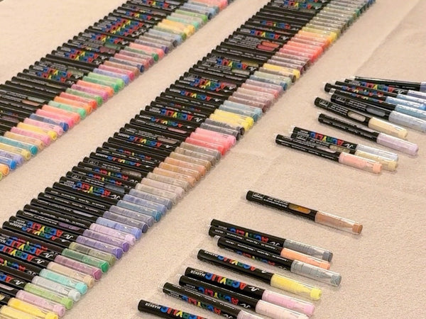
Sorting markers
For large packs, I find that this is an essential step before coloring ☺️
Personally, I always sort my markers in ascending order for practical reasons 🌸
If your swatch chart is by color, you can also sort your markers column by column, following the order of your swatch chart, the result will be super aesthetic 🌈

Sorting markers
For large packs, I find this to be an essential step: both for coloring your swatches, and for coloring later on 🥰
Take the example of coloring the GuangNa 288 swatch chart. The first box is marker #670, so you'll need to find it among a pack of 288 markers. If your markers aren't sorted, you'll lose a lot of time 🙏
The same principle applies when you color: once you've chosen the color on your swatch chart, you need to retrieve the corresponding marker.
In ascending order or by colors?
There are really 2 teams in the coloring world: team ascending order for the practical side, and team by colors for the aesthetic side 🌈
- In ascending order
After trying both methods, I'm on team ascending order for the practical side 🥰
This classification allows me to quickly find the marker I'm looking for to use it, but also to easily put it away after use ☺️
For packs with letters, such as Languo brush LC-111, LC-112..., I first sort by alphabetical order and then by ascending order.
- By colors
If your swatch chart is by colors, you can also sort your markers by following the order of your swatch chart column by column, the result will be super aesthetic ✨
Note that not all swatch charts are by colors. Some follow the brand's swatch chart order, others are by colors, and others have both versions 🥰
To know the available versions, go to the swatch chart description: the color version is called "rainbow version" 🌈
To learn more about the benefits of rainbow swatch charts and the behind-the-scenes process, click here 📖👩🎨
Some storage examples
Some original storage solutions allow for direct storage, for example:
- Tiered boxes

- Compartmented boxes

- Pencil cases

If your original storage doesn't allow it or you want to store your markers differently, here are some ideas:
- White lockers

- Transparent drawers
They allow for storage in small groups. Very practical for small packs like Tooli-Art or Languo brush/gel by storing one pack per drawer. You can also use them for large packs by storing them in groups of 10 markers, for example.

Selection extracted from my social networks ✨
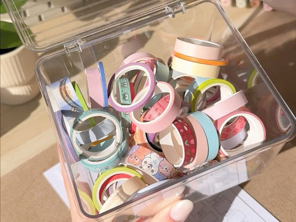
Masking tape
For an ultra-crisp finish on my swatches, I love using masking tape, but it's totally optional 🥰
You'll find all my tips for placing it correctly and not tearing the paper in the full guide ✨

Masking tape
For an ultra-clean finish on my swatch charts, I love using masking tape, but it's totally optional ✨
- Result with masking tape:

- Result without masking tape:

It's important to know that using masking tape can cause some problems: bleeding when the marker goes under the tape, or tearing the paper when removed. But with the right material and a few tips, everything goes smoothly 🥰
Choosing masking tape
Not all masking tapes are created equal, here are a few important points to check 🙏
- Strength 👊: so it doesn't break when you unroll it.
- Balanced adhesive power ⚖️: sticky enough so that the ink doesn't bleed underneath and cause no smudges, but not too sticky so you can remove it without damaging the paper.
- Color 🎨: having at least a few light, solid-colored rolls is very practical for seeing numbers through transparency. Otherwise, you can open the PDF in parallel for reference.
- Width 📏: make sure it's thin enough to fit between two squares. I primarily use the thicker one (1cm) because I find it easier to handle, and I only switch to the thin one (3mm) when necessary.

How to place it correctly depending on the type of marker
- For acrylic markers, I stick it outside the squares. The dots therefore appear in the area to be colored, and disappear once covered by the opaque marker ✨

- For alcohol markers, I stick it inside the squares. Since alcohol markers tend to spread, sticking it inside gives me a safety margin and prevents bleeding 🥰

- For other mediums (water-based markers, pencils), I haven't tested with masking tape yet ☺️
My tips for not tearing the paper
Here's the result of my very first attempt with masking tape 🤭

After numerous tests, I found the right material and the right tips, and since then I haven't had any problems 🥰🤞

- The right material
I use thick, sturdy paper with quality masking tape.
- Do not stick to the edges
Edges are fragile, and that's often where the paper starts to get damaged.
So I fold the masking tape back on itself so it doesn't stick to the edge, which also creates a tab for easy removal 🥰

- No more than one day
When I start a sheet, I finish it the same day; I never leave the masking tape on overnight 🌙
- Remove gently by folding it back on itself
Remove very gently, avoiding pulling upwards; it's better to fold the masking tape back on itself ☺️

- Other tips
Here are some other tips that I don't use, but might be helpful to you:
- Stick it on your desk to reduce adhesion before applying it to the paper (note that this can promote bleeding).
- Heat with a hairdryer to soften the adhesive before peeling it off.
Selection extracted from my social networks ✨
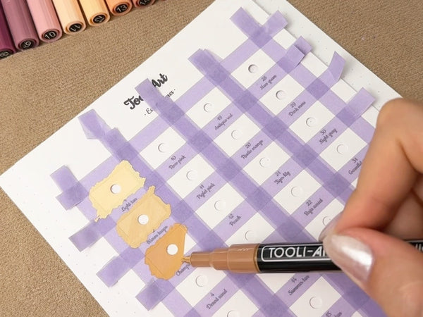
Acrylic markers
The swatches for acrylic marker swatch charts are filled with light-colored dotted lines. Since acrylic markers provide opaque coverage, these intentionally discreet boxes become almost invisible once colored in.
The central dot serves as a guide for punching a hole right in the center ✨
For coloring, I apply 2 coats, and add a 3rd for the lighter colors.

Coloring
Acrylic markers
The Boxes
The boxes for acrylic marker swatches are in light dotted lines. Since acrylic markers have an opaque finish, the deliberately subtle boxes become almost invisible once colored.

The central dot serves as a guide for perforating right in the center. Remember to perforate before coloring, otherwise you won't see the dots anymore ✨
Coloring
For coloring, I do 2 coats and add a 3rd for the lightest colors 🥰
As it dries, the color of the marker on the paper changes slightly, which is your cue to know when you can apply the next coat (about 3 min) ☺️
A small exception for 0.6 mm gel pens, which are used in a single coat: if you go over it a second time, it will move the color underneath. Be aware that gel pens take longer to dry than classic acrylic markers 🙏
Selection extracted from my social media ✨
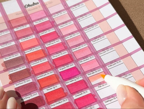
Alcohol markers
The cells in the alcohol marker swatches are outlined in solid black lines. Since alcohol markers have a transparent finish, the cells remain visible and clearly define the area even after the marker is applied 🖍️
For each swatch, you have the choice between 2 versions: one with perforation dots, and one without 🥰
For coloring, I apply only one layer ✨

Coloring
Alcohol markers
The Boxes
The boxes for alcohol marker swatch charts have solid black lines. Since alcohol markers have a transparent finish, the boxes remain visible and clearly define the area even after the marker is applied ✨
For each swatch chart, you have 2 versions:
- without perforation circles

- with perforation circles

If you do cozy coloring without legends, you won't need the holes, but if you like cozy coloring with legends, I recommend choosing the version with perforation circles.
For alcohol markers, I always punch after coloring. Punching before can interfere with coloring, and since the markers have a fairly transparent finish, the circle remains clearly visible 🙏
Coloring
For coloring, I use only one coat 🥰
Selection extracted from my social networks ✨
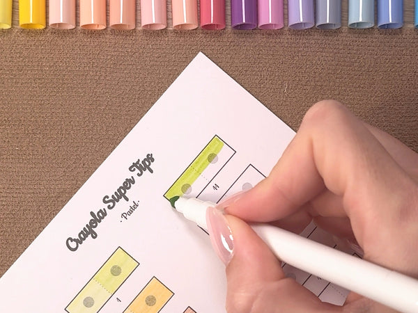
Water-based markers
The cells in the water-based markers swatches are double. Since water-based markers are used in one layer or two layers for shadows, the double cells allow you to visualize the rendering of one and two layers.
The central dots serve as a guide for perforating right in the center ✨

Coloring
Water-based markers
The swatches
The swatches for water-based markers are double. Since water-based markers are used in one layer or two layers for shadows, the double swatches allow you to visualize the result with one and two layers 🥰

The central dots serve as a guide for punching precisely in the center. You can punch after coloring: since the markers have a fairly transparent finish, the dots remain clearly visible, and the holes won't bother you while coloring ✨
Coloring
For coloring, I start with one layer everywhere, then I add a 2nd layer only on the second swatch 🎨
Selection extracted from my social media ✨

Colored pencils
The swatches for colored pencils are in solid black lines. Since the pencils have a transparent finish, the boxes remain visible and clearly define the area even after the pencil is applied 🌸
For each swatch, you have the choice between 2 versions: one with perforation dots, and one without ✨
For coloring, you can color uniformly, or like me, create a gradient 🥰

Coloring
Colored pencils
The Boxes
The boxes on the colored pencil swatches are outlined in solid black lines. Since colored pencils have a transparent finish, the boxes remain visible and clearly define the area even after applying the pencil 🌸
For each swatch, you have 2 versions:
- without perforation dots

- with perforation dots

The central dot acts as a guide for perforating right in the center. You can perforate after coloring: as colored pencils have a fairly transparent finish, the dots remain clearly visible, and you won't be bothered by the holes when coloring ✨
Coloring
For coloring, you can color evenly, or like me, create a gradient by pressing firmly on the left side and gradually releasing the pressure 🥰
Selection extracted from my social media ✨
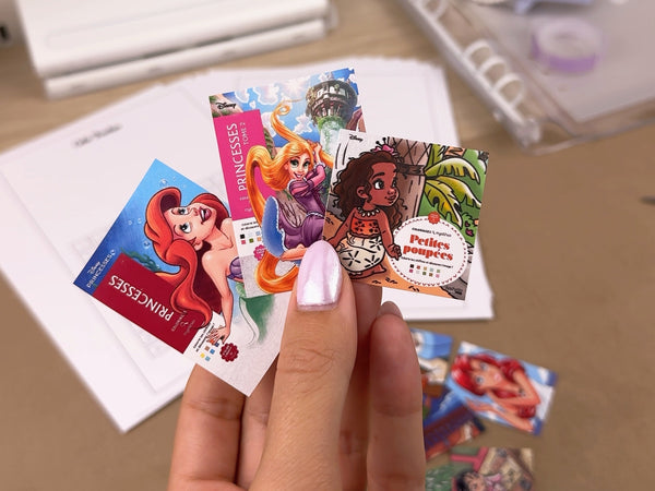
Creating your thumbnails
To illustrate some of the sheets, you can add thumbnails:
- Cover thumbnails on Colo Tracker sheets
- Solution thumbnails on Color Codes sheets
For the layout, I've prepared a Canva template for you where all you'll have to do is drag and drop your images, and they will automatically resize 🖼️

Creating your thumbnails
To illustrate some sheets, you can add thumbnails:
- Cover thumbnails on Colo Tracker sheets
- Solution thumbnails on Color Code sheets

On each sheet, a box is provided for sticking the thumbnail. This is totally optional, the sheets also exist in a version without a box ☺️

Getting the images
- For covers, I go to the book's Amazon page, then right-click "Save As..."
- For solutions, I scan my volume and then take screenshots of each solution. You can also take photos 🥰
The Canva Template
I created a Canva template to help you print your thumbnails to the correct dimensions. You just have to drag your photos into the frames, they will resize automatically ✨
Here are the steps to follow:
- Open the Canva template (link in the material section)
- File, Duplicate (otherwise you won't be able to modify the template)
- Drag your photos into the frames
- File, Download, PDF for print (for optimal print quality)
Printing
Here are the important settings to get nice, correctly sized thumbnails:
- Scale: actual size (100%)
Make sure to check this option, otherwise you risk having extra margins and your thumbnails will not be the correct size.
- Optimal quality
For a crisp, clear result. Depending on your printer, this setting may also be called "High quality," "High," etc.
- Media type: glossy photo paper
I print on glossy sticker paper, but you can certainly print on classic glossy photo paper and then use glue. If you prefer a matte finish, I've also included a link to a good quality matte sticker paper; in that case, remember to select "matte photo paper" when printing 🥰
Important note 🤍
I cannot share the images with you due to copyright restrictions 🙏
I spoke directly with Hachette about this, and they confirmed that any distribution, even free, is prohibited 🚫
For covers, I know it might seem surprising since they are visible online for free, but they remain the protected property of the authors and publishers. We can copy and print them for our personal use without issue, but publicly distributing them without permission is prohibited, and Hachette explained to me that Disney does not grant this type of authorization.
Let's be supportive and respect everyone's work
🤝🤍
Selection extracted from my social networks ✨
I can't wait to see your results 🌸
Feel free to tag me on social media and leave a review for the shop here ✨